
BirdDog · Brand Kit
For the land you call yours.
Everything BirdDog, in one place: the logos, the palette, the type, the icons, and the loader. Download what you need, keep it proper.
Logos (SVG + PNG), the dog mark, the loader, the display fonts.
The logos
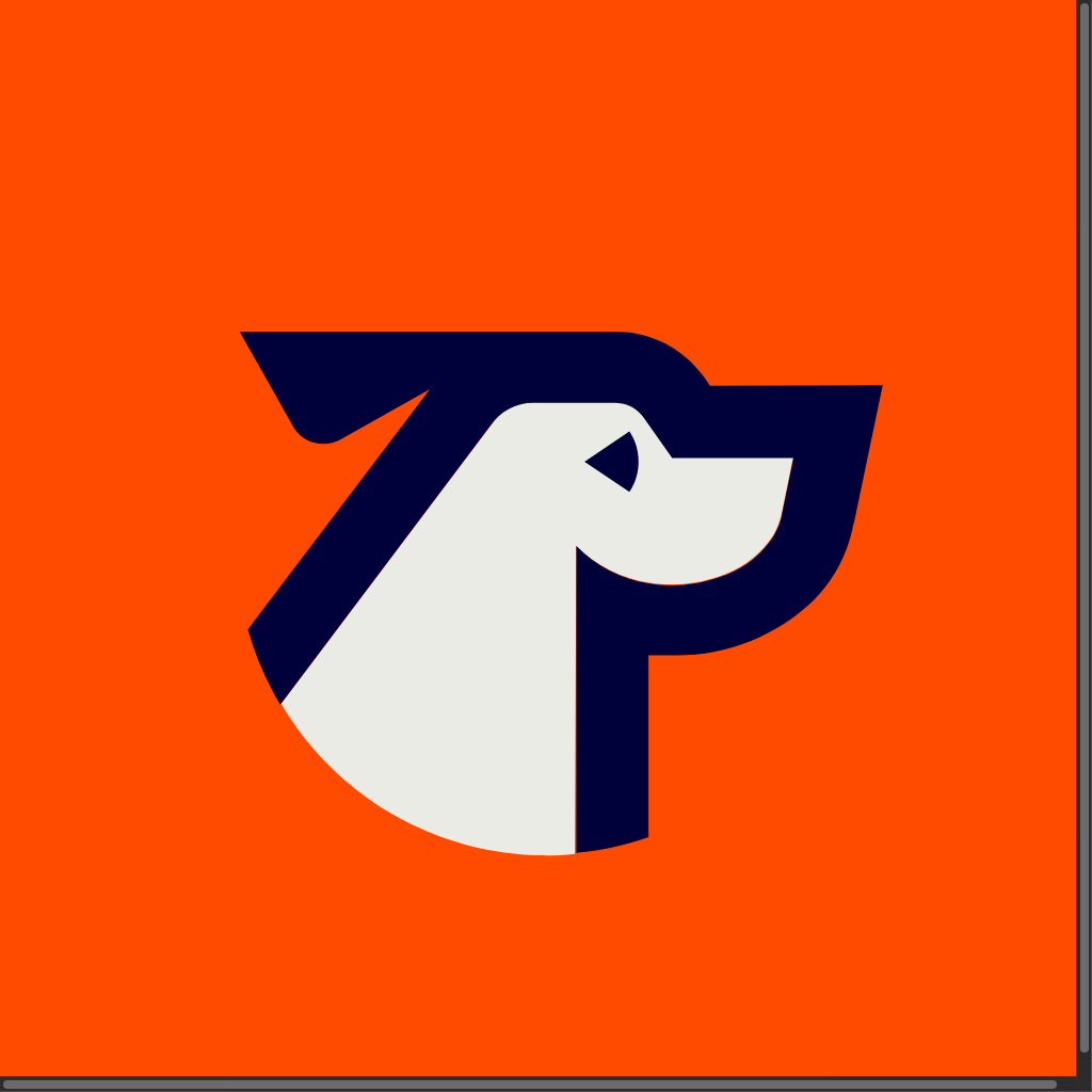
The lockup is the pointing dog over the wordmark — the full unit, always. The dog mark (the orange square) is the app icon and social avatar. Give the lockup clear space at least the height of the “B” on every side.





The don’ts
- • Don’t recolor the lockup (dark or white only).
- • Don’t stretch, rotate, or re-set the wordmark.
- • Don’t put the dark lockup on dark ground.
- • Don’t separate the dog from the wordmark in the lockup.
Color
Hunter Orange is the action — buttons, links, the point. Midnight is the authority — headlines and dark grounds. Sand and Cream are the paper. Click any chip to copy the hex.
Hunter Orange
Primary. Actions, links, accents.
Midnight
The ink. Headlines, dark sections.
Sand
The quiet ground behind cards.
Paper
The page itself.
Ember
Hunter Orange on hover.
Orange Tint
Selected states, soft callouts.
Ink Muted
Secondary copy.
Ink Faint
Captions, placeholders.
Retired: the legacy orange still lives in old assets. The current action color is Hunter Orange #FF4B00 — replace on sight.
Typography
Obviously Wide carries the big campaign headlines. Archivo carries product and marketing headings. Inter is the interface and the body, everywhere. Lora is the editorial voice for long reads.
Steward with confidence.
Obviously Wide · 600/700
The display face — hero headlines on the homepage and the campaign pages. Sentence case, tight leading, big or nothing.
Obviously is a commercial typeface (DJR). Licensed for BirdDog use; outside use needs its own license from the foundry.
Insurance, tax, financing, real estate.
Obviously · 700
The same voice at a standard width — dense headlines, cards, the app.
Find the right help for your land.
Archivo · 600–800
Marketing + product headings where Obviously isn’t set. Free (Google Fonts).
Google Fonts ↗Tell us about your land and get a free estimate of your potential deduction.
Inter · 400–700
The workhorse — every interface, form, table, and body paragraph. Free (Google Fonts).
Google Fonts ↗“The land tells you what it needs. Our job is to listen, then work.”
Lora · 400/600 + italics
The editorial serif — quotes, stories, and the library’s long reads. Free (Google Fonts).
Google Fonts ↗Icons
The icon system is Phosphor — fill weight in marketing, regular in product. Rounded, confident, never decorative without a job. A few of the working set:
piggy-bank
shield-check
bank
chart-line-up
handshake
compass
plant
phone
Motion
The running dog
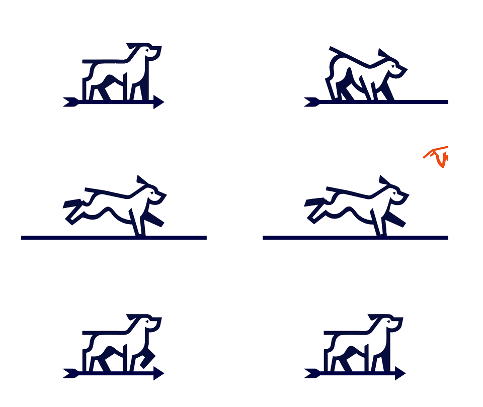
The brand’s loading animation — a white-background 16:9 loop in a rounded card. Use it anywhere a spinner would do and the wait deserves personality: page loads, searches, calculations.
Voice
Plain talk
Short sentences. Landowner words, not industry jargon. If it needs a glossary, rewrite it.
Landowner-first
Their land, their call. We advise with numbers and shut up with the sales pitch.
One number
Every page, every asset, one phone: (979) 530-7582.
Questions on usage?